Linear Portions of the Curves:
Many scientific instruments will only yield a linear response function over a certain concentration range; beyond this region, the calibration curve will be nonlinear. It is therefore important to choose the correct region for linear regression analysis in order to minimise any errors due to nonlinearity.
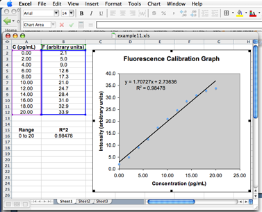
A quick and convenient way to accomplish this is to visually inspect the graph and select only those data points that appear to lie on a straight line, as well as a few points on either side of the linear portion. Consider, for example, the fluorescence calibration data from the previous example but over an extended concentration range:
| C (pg/mL): | 0 | 2 | 4 | 6 | 8 | 10 | 12 | 14 | 16 | 18 | 20 |
|---|---|---|---|---|---|---|---|---|---|---|---|
| Intensity: | 2.1 | 5.0 | 9.0 | 12.6 | 17.3 | 21.0 | 24.7 | 28.4 | 31.0 | 32.9 | 33.9 |

Extended fluorescence calibration curve showing curvature at high concentrations
 Note how the
source data is framed when the chart is selected. If you move the
cursor over the box in the lower left corner of each column, you can
change the selection of points used to produced the chart.
Note how the
source data is framed when the chart is selected. If you move the
cursor over the box in the lower left corner of each column, you can
change the selection of points used to produced the chart.