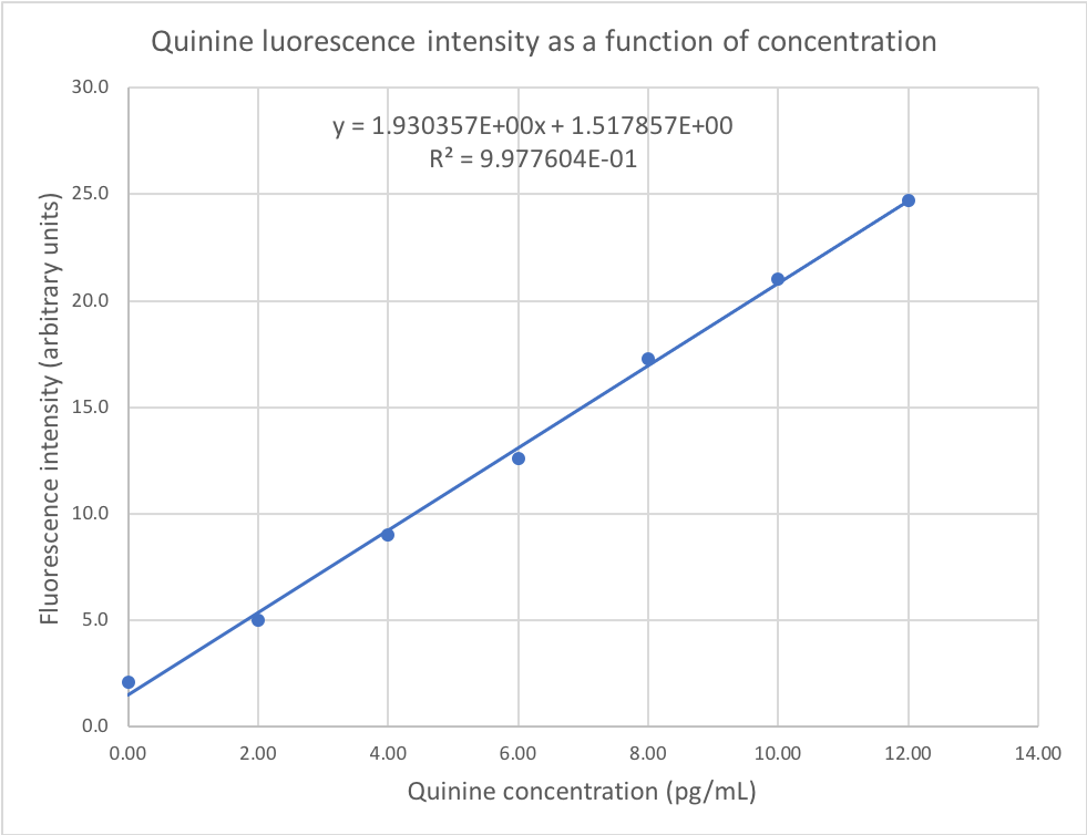
Calibration and Trendlines:

Most analytical chemistry measurements involve calibration functions that can be described using a straight line. Excel has a feature that allows you to easily display a linear trendline on your graphs, which is the best-fit straight line through your data. This feature also allows you to view the equation of the best-fit line, as well as the correlation coefficient; both of these are determined using the mathematical technique of linear regression analysis. The trendline feature provides a quick test of the linearity of your calibration data. A more complete treatment of linear regression will be provided in a later section.

A calibration curve is an equation that permits us to calculate a desired experimental result in terms of another. In the simplest form, this is given as the equation of a straight line where the x-value is the input (usually concentration) and the y-value is the output (usually the measured instrument response). As we saw in the preceding example, the relationship between response and concentration is not always linear, although it is usually possible to linearise the equation – that is, transform the data into a form that is linear, such as E versus log C.

Tips & links:

Straight line: y=bx + a

Slope b = (y2 - y1)/(x2 - x1)

Skip to Specimen Data

Skip to Adding a Trendline

Skip to Explanation

Part 1: Specimen Data

In this section, we will use the following calibration data for a fluorescence spectrophotometry experiment. The data is taken from Miller and Miller. Enter the following data in the second two columns of a new Excel spreadsheet. Column B should contain the concentrations and column C the fluorescence intensities. This makes it easier to get the required plot in Excel. Remember that we are determining the regression of y on xi.e. the dependence of the measured intensity (dependent variable) on the standard concentration (independent variable).

Concentration / pg mL-1Intensity
0.002.1
2.005.0
4.009.0
6.0012.6
8.0017.3
10.0021.0
12.0024.7

Don’t forget to include headings for each column in the spreadsheet, and format the cells to display the correct number of decimal places. Once the data is entered and formatted correctly, select both columns then choose Insert→Chart and insert an XY Scatter Plot without connecting lines or interpolated curves as explained previously.

Skip to Adding a Trendline

Skip to Explanation

Hint: Put the independent variable (x) in the first column, and the dependent variable (y) in the second.

Part 2: Adding a trendline

Right-click on any point on the graph, then choose Add Trendline... to open the formatting pane (or formatting dialog in older versions). Make sure that a linear trendline is selected (but note the other types available!), then click on the Options tab.

adding a trendline to a plot in Excel  setting the trendline parameteres in Excel

Check the options for Display equation on chart and Display R-squared value on chart. This will add both the equation for the best-fit straight line through the data and the squared value of the product-moment correlation coefficient (R2) to the chart.

Once you have the equation and R2 on the chart, you will need to format the numbers in this display in order to obtain sufficient figures for accuracy in any further calculations. To do this, right-click on the equation and choose Format Trendline Label... from the contextual menu, or left-click on the equation and choose Format→Format Selection... to opening the formatting pane. The Number setting will allow you to switch between a number with fixed decimal places or scientific notation; you will need to display at least 5 d.p. on your chart.

The Chart wizard and chart options were covered in the section on plotting

Skip to Explanation

Part 3: Finished Chart & Explanation

When you are done, your calibration graph should look like the following. More details are provided in the linear regression section, but some explanatory comments are necessary here:

finished graph

The best-fit straight line (the line of regression of y on x) is calculated assuming that all errors are in the measured (y) values, not in the concentration (x) values.)

This regression line minimizes the distance in the y direction between the line and the individual points, and passes through the centroid of the data (mean x & y values)

R is a measure of correlation, not linearity. As a result, it can be misleading. You should always look at the graph with the best-fit straight line rather than relying on R alone when evaluating linearity.


Try This:

Open up the potential energy data from the earlier exercise. What value of R2 do you think you'd get from a linear trendline through this data? Remember that y was calculated as a function of x... Try it!

What about data calculated using y = x1/2 for x = 3 to 10? What R2 value would you expect from putting a linear trendline through this data? Try it!

Continue to the next section on basic statistics...

Download a specimen Excel file for this exercise